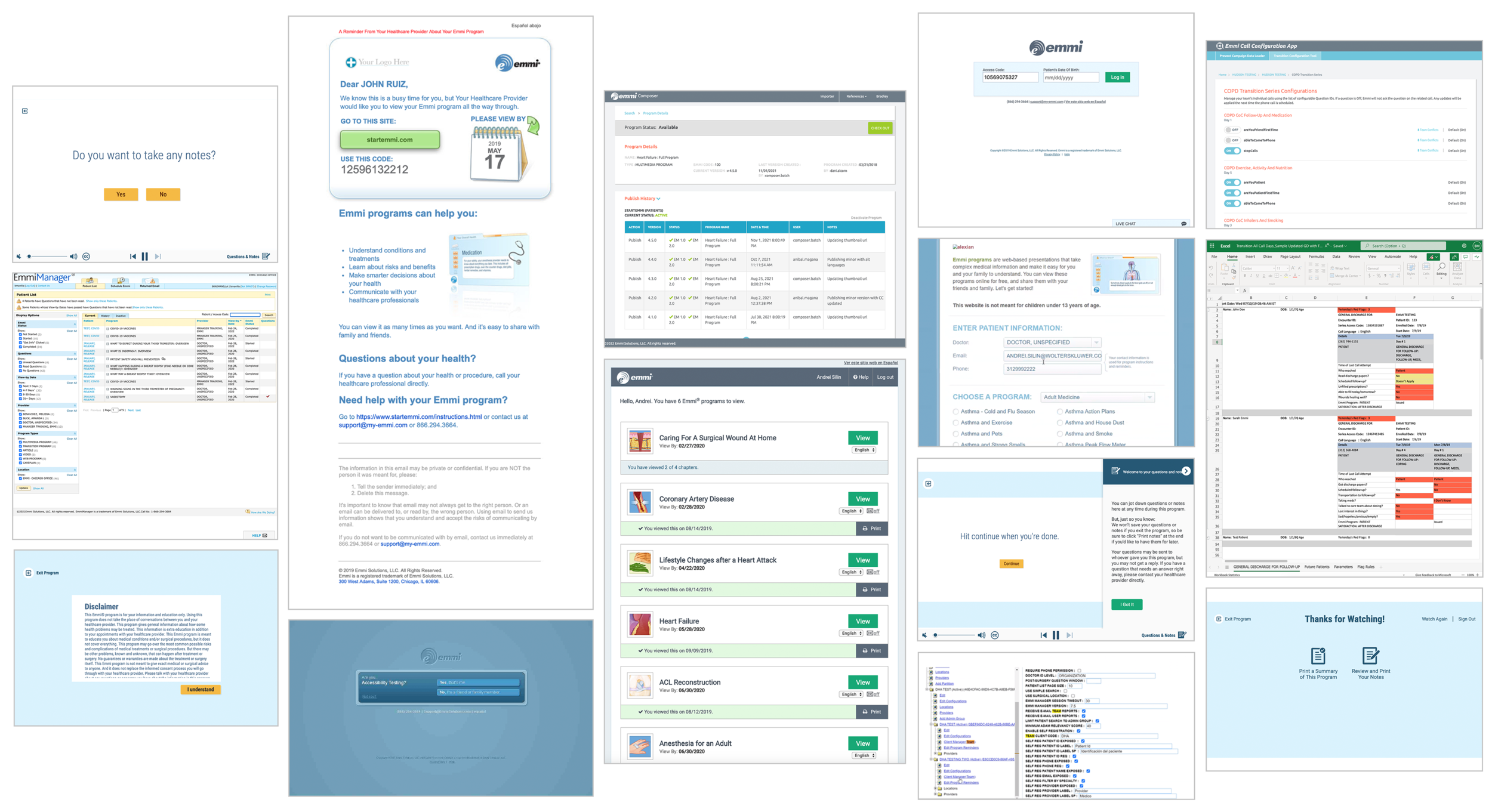
Meet the Family
I joined the Emmi team soon after their acquisition by Wolters Kluwer (WK). In order to capitalize on Emmi’s incredible depth of content, its applications need to align with the aesthetics of the WK brand identity.
With each release and new application developed, my team looks for opportunities to elevate the experience using a unified brand strategy as well as explore new ways to evolve the brand forward. This brand alignment allowed the applications within the Clinical Effectiveness division to be sold as cohesive package of applications and content.
Emails
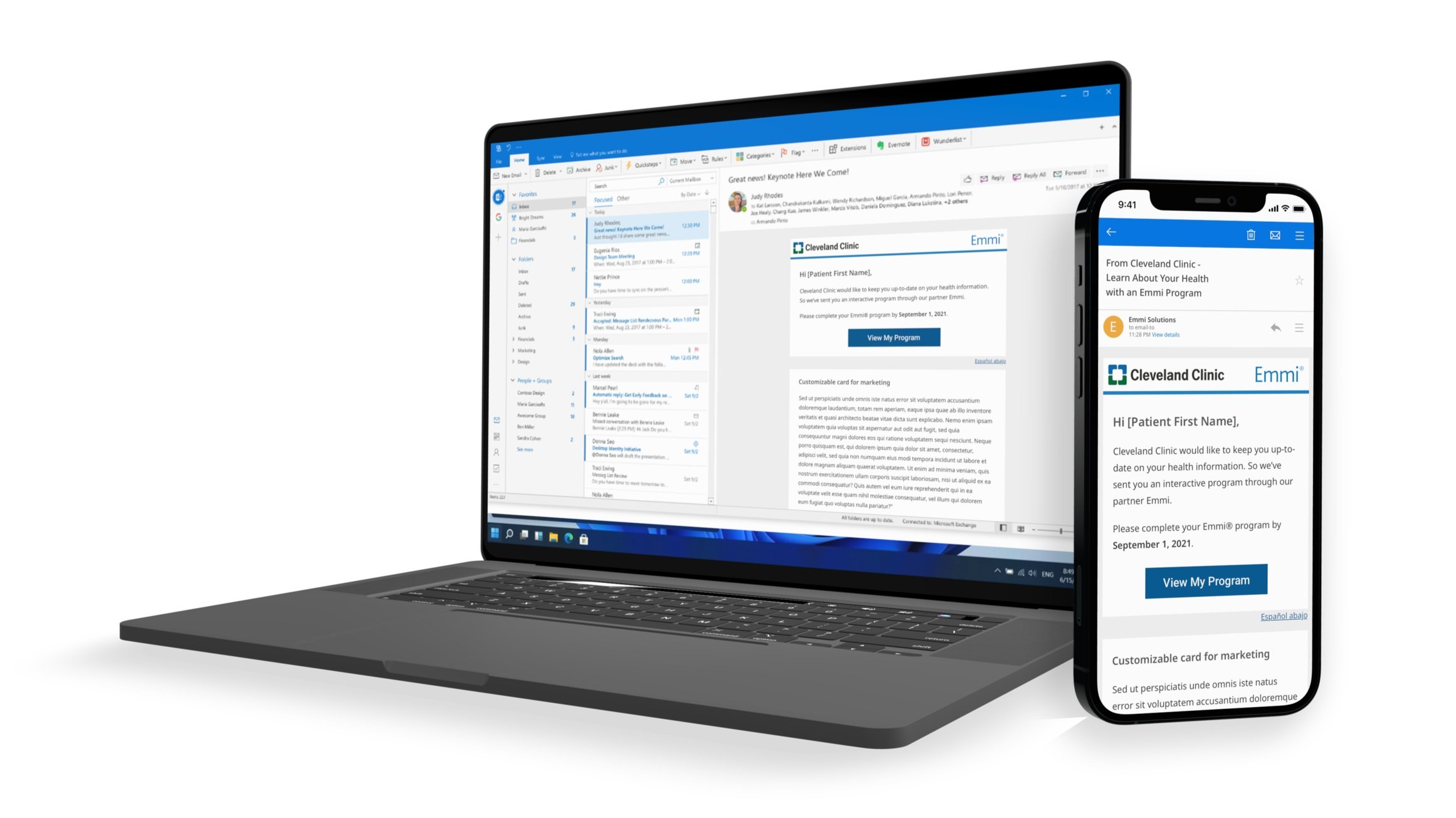
Being the first patient touchpoint, emails are arguably the most important. All the hard work making killer applications doesn’t matter if you can’t land that initial click.
The most significant change we made was designing with a mobile first strategy and ensuring the call to action stayed above the fold no matter the phone or email client. With that as our guiding star, we ditched the 90s design vibes, cleaned up the UI, and reduced the embedded images due to the large number of mail clients that turn them off by default.
StartEmmi
This site redesign was the first time we dealt with blending two distinct brand styles. Emmi is patient facing, and as such, has cultivated a very approachable, safe space, and beautifully-illustrated content style. In contrast, the Wolters Kluwer design system is clinical facing with a very structured and sterile approach with the focus on enabling medical staff’s ability to quickly scan for answers.
The resulting design more prominently showcases the approachable illustrations while leveraging the WK design system for the structure, color, typography, and iconography. Being designed in a responsive manner, we were also able to retire a separate application required specifically for mobile users.
Video Player
When a patient views our multimedia programs, they’re either engaging with a video player or a HTML5 application, depending on the program watched. Each player has its technical limitations so the first step was to find an updated design style that could be implemented on both players. Once the foundation for design was defined, we expanded functionality by adding speed controls, refined closed captioning, and improved the overall accessibility.
Healthcare Content Browser
With the development of our Healthcare Content Browser, we seized a rare opportunity to truly push the WK brand identity forward, aiming to move it towards the highly polished health and wellness space. This brand evolution was further complicated by the diverse set of target users (patients, clinicians, and medical procurement) and the need to manage the input from stakeholders across many business units. Serenity now.
Illustrations
Emmi’s business was built upon the beautiful visual design within their educational programs. However, these visual assets weren’t being leveraged beyond the programs themselves. As we continued to expand our applications, update their user interfaces, and elevate the sales experience, we look for every opportunity to celebrate our illustrations as it’s truly a market differentiator.


